Mobile Friendly Website Boone: Don't Let a Clunky Site Kill Your High Country Hustle

Your website is sabotaging your High Country hustle. Every day, it tells potential customers to keep scrolling.
We get it. You're busy running your business. You've felt that gut-punch when a tourist can’t pull up your menu on the Parkway, or when your mobile bounce rate climbs higher than Howard's Knob. Frustration with slow developers and outdated sites is real. It feels like you’re stuck on mountain time as the world flies by.
This is your wake-up call. We’ll show you why a mobile-friendly website for Boone businesses is essential. Forget waiting weeks for a fix; we’re talking a total glow-up that looks great on any screen and loads fast. In this article, we’ll break down how to get a site that makes your competition look ancient, all in 48 hours.
Key Takeaways
Discover how to run a 5-point "Mountain Mobile Audit" to see if your site is actually built for Boone's on-the-go customers.
Learn why a 3-second load time is non-negotiable and how designing for "fat thumbs" can capture more High Country clients.
Understand why a truly mobile-friendly website for Boone businesses needs to go way beyond just a shrunken-down desktop version.
Find out how to ditch the 6-month agency slog and launch a killer, high-performance mobile site in just 48 hours.
Why Your Boone Business Lives or Dies on a Smartphone Screen
Let’s get one thing straight. A mobile-friendly website isn’t just a smaller desktop site. That’s a lazy myth. It’s a different beast. A total rethink. It’s an experience built for the thumb-scrolling, tap-happy world we live in. Big buttons. Fast load times. No pinching or zooming. This isn’t just smart; it’s essential. Responsive web design lets your site adapt to any screen. Slick, right?
Here in the High Country, customers aren’t at desks. They’re cruising the Blue Ridge Parkway, looking for a brewery. They’re App State students on King Street, deciding where to eat. BrightLocal’s 2023 survey found that 98% of consumers use the internet to find local business info. In a tourism and university-driven town, that search happens on the phone.
And Google knows it. That’s why they switched to "Mobile-First Indexing" back in 2019. Translation: Google's search bots now look at your mobile site first to decide how to rank you. Your beautiful, expensive desktop site? It’s the B-squad. If your mobile experience is a clunky, slow-loading mess, you're basically invisible. A great mobile-friendly website for Boone businesses is no longer an option; it's the price of admission.
A bad mobile site kills the vibe—and your revenue. Google data shows 53% of mobile visitors leave if a page takes more than three seconds to load. That’s not just a lost click. That’s a customer who tried your site, cursed it, and walked into your competitor’s shop.
The Tourism Factor: Capturing the High Country Traveler
Imagine a family visiting from Charlotte, exploring Blowing Rock for the day. They search for "best dinner in Boone." Your site pops up. But your menu is a clunky PDF that won't load on spotty mountain cell service. They're gone. A mobile-optimized site prioritizes what they need, right now: a big "Click-to-Call" button and a "Get Directions" link that opens straight into Google Maps. It's about turning that split-second impulse into a reservation.
App State and the Next Gen of Boone Customers
Ready to stop losing customers and start building a brand that shows up on every phone? Contact us today to schedule your free Mountain Mobile Audit and see how you can upgrade your site in just 48 hours. Make your Boone business impossible to ignore—take action now and capture every customer, wherever they are.
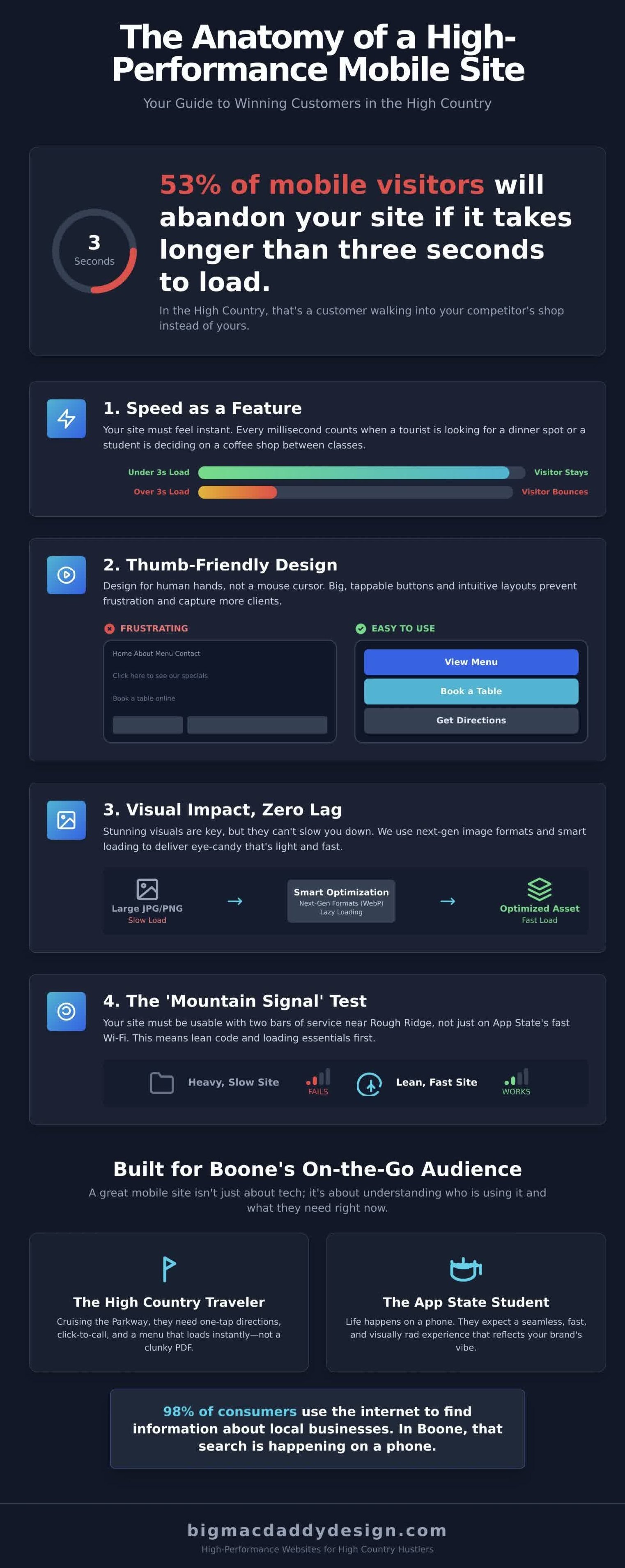
The Anatomy of a High-Performance Mobile Site in the High Country
Let's get real. A website isn't just a digital brochure. It's a vibe. It's an experience. For a visitor exploring Boone on their phone, your site is your handshake, your storefront, and your sales pitch all rolled into one. If it’s slow, clunky, or broken, that’s the impression they get of your brand. A high-performance, mobile-friendly website isn't about checking a box; it's about making a statement that you respect your customers' time and attention.
It's about nailing four critical pillars:
Speed as a Feature: Forget slow. We’re talking instant. According to Google, 53% of mobile users will bounce if a page takes more than three seconds to load. Three. Seconds. That’s the window you have to capture someone looking for a last-minute dinner spot on King Street or checking trail conditions from a scenic overlook.
Thumb-Friendly Navigation: Your site has to feel good to use. Big, juicy buttons your thumb can actually hit. Menus that make sense. No frustrating pinch-and-zoom gymnastics required. It’s about designing for human hands, not a precise mouse cursor.
Visual Impact, Zero Lag: Yeah, you need that epic drone footage of the Blue Ridge Parkway. We get it. But it can't bring a phone to its knees. We’re talking next-gen image formats and smart video loading that deliver the eye candy without burning through a tourist's data plan.
The 'Mountain Signal' Test: Your site has to work everywhere. Not just on App State’s killer Wi-Fi, but with two bars of service near Rough Ridge. A rock-solid mobile site is built lean and mean, loading the essentials first so it's usable even when the 5G signal is a myth.
Responsive vs. Adaptive: What Boone Biz Owners Need
Responsive design is the undisputed champ. It means you have one website that uses a fluid grid to automatically reflow and resize itself for any screen. It looks rad on an iPhone, an iPad, and a giant desktop monitor. This isn't just our hot take; it's the foundation of Google's responsive design best practices. Separate "mobile-only" sites are a relic from 2010, creating double the work and a maintenance nightmare. The BigMacDaddy approach ensures your brand's swagger is never compromised, no matter the device.
Core Web Vitals: The Tech Stuff That Actually Matters
Google has three big metrics to measure your site's user experience, and they are non-negotiable for SEO. Here’s the no-BS breakdown:
LCP (Largest Contentful Paint): How fast does the most important thing (like your main image or headline) load? If it's over 2.5 seconds, you're losing people. First impressions are everything.
FID (First Input Delay): When a user taps a button, how fast does the site react? Anything over 100 milliseconds feels laggy and broken. It's the digital equivalent of a sticky door.
CLS (Cumulative Layout Shift): Ever try to tap a link, only for an ad to load, shifting the whole page so you tap the wrong thing? That's CLS. It’s infuriating, and Google penalizes sites for it.
Passing the Core Web Vitals test is a huge part of what makes a truly mobile-friendly website that businesses can count on. Getting these technical details perfect is an art form, and frankly, it's the kind of obsessive work we live for.
Responsive Design vs. 'Mobile-Ish': Why Generic Templates Fail Boone
Let's get real. That $50 theme you found looks slick in the demo. It promises the world. But here’s the hard truth: a ‘one-size-fits-all’ template usually fits nobody in the High Country. It’s a digital paint-by-numbers kit that leaves your brand looking generic, feeling slow, and totally disconnected from the Boone vibe. You’re not a faceless corporation in a downtown high-rise. You’re a Boone original. Your website should scream it from the mountaintops.
The biggest problem with these off-the-shelf themes is bloat. They’re packed with code for every possible feature, from e-commerce shops to podcast players. A 2021 analysis by Kinsta showed that some popular multipurpose themes load over 50 separate JavaScript and CSS files. The result? A digital boat anchor. All that useless code has to load, and up here, where cell service can drop from five bars to one in the span of a hundred yards, that extra weight kills your speed. A Google study found that 53% of mobile visitors will bounce if a page takes longer than three seconds to load. Your generic theme is practically handing customers to your competition.
The Hidden Cost of 'Cheap' DIY Builders
Think a Wix or Squarespace template is the easy button? Think again. While they market simplicity, getting a truly custom, high-performing, mobile-friendly website for businesses is a different story. You spend hours wrestling with their clunky 'mobile editor', dragging and dropping elements that refuse to align, only to find it looks completely broken on your friend’s phone. It’s a frustrating compromise that never quite captures your vision.
Local Visuals and Mobile UX
That killer drone shot of the Linn Cove Viaduct deserves to be a hero, not a pixelated thumbnail. A generic template doesn't know how to handle Boone's epic visuals on a small screen. It just shrinks everything down, making your stunning mountain photography a cluttered, illegible mess. A true mobile-first design considers how those visuals translate across devices. It means strategic cropping, custom layouts that let the landscape breathe, and ensuring your text is crisp and readable, not lost over a busy background of fall foliage.
This is the BigMacDaddy difference. We don't just make your site 'mobile compliant'. We build a hand-crafted mobile experience designed for raw impact. It's about more than just passing a Google test; it’s about creating a connection that drives business. In fact, a 2022 Forbes article details the incredible benefits a mobile-first approach can deliver, from higher engagement to a significant boost in leads. We craft a lean, fast, and visually stunning mobile-friendly website that businesses can use to dominate, not just compete. Stop settling for 'mobile-ish'. Let's build something with a pulse.
The 5-Point Mountain Mobile Audit: Is Your Site Actually Working?
You think your website is hot stuff. A digital masterpiece. But have you ever tried using it on your phone with one bar of service at the top of Howard's Knob? Let's get real. A pretty desktop site means nothing if it falls apart on a 6-inch screen. Time for a gut check. Here’s the BigMacDaddy Design audit to see if your site is actually built for Boone.
Run through this list. No excuses.
The 3-Second Rule: According to Google's 2018 research, 53% of mobile users will bounce if a page takes longer than three seconds to load. Head to a local spot like Hatchet Coffee, connect to their Wi-Fi, and time your homepage. One Mississippi, two Mississippi… are they gone? Spotty mountain connections make speed non-negotiable.
The 'Fat Thumb' Test: Open your site and try to tap your main navigation links. Can you hit "Services" without accidentally hitting "About Us"? If you have to pinch-and-zoom to click a button, you’ve failed. Apple’s own guidelines recommend a minimum tap target of 44x44 points for a reason. Don't make users work for it.
Visual Hierarchy: What’s the first thing someone sees when they land on your site? It better be your phone number, your hours, or a massive “Book Now” button. Visitors looking for a mobile-friendly website for Boone businesses need info now. They aren't on a leisurely scroll; they're on King Street looking for directions. Put the mission-critical stuff above the fold. Always.
The Form Factor: Is your contact form a total nightmare? Tiny text fields, endless dropdowns, and impossible CAPTCHA are conversion killers. A 2022 Baymard Institute study found that overly complex checkout or form processes accounted for 17% of cart abandonment. Simplify it. Ask for a name, an email, and a message. That’s it.
Cross-Browser Check: Your site looks rad in Android Chrome. Awesome. But did you know that, as of November 2023, Statcounter data shows that Safari holds over 25% of the US mobile browser market? You can't just ignore a quarter of your potential customers. Test it on Safari. Test it on Firefox. A truly responsive site looks killer everywhere.
Google's Free Tool: The Moment of Truth
Don’t just guess. Get Google’s official verdict. Head to their Mobile-Friendly Test tool, plug in your URL, and hold your breath. It will spit out a clear pass or fail. Pay close attention to red flags like "Text too small to read" or "Clickable elements too close together." These are the exact issues that make users rage-quit your site.
Check Your Analytics: The Leaky Bucket
Data doesn't lie. Log in to your Google Analytics and navigate to Audience > Mobile > Overview. Compare the bounce rate for mobile users to your desktop users. Is your mobile bounce rate more than 15% higher? If so, you've found the leaky bucket in your sales funnel. People are showing up from their phones and leaving immediately because the experience is a bust.
Did your site fail this audit? Don't sweat it. BigMacDaddy Design builds every site to crush this test from day one. Let's build a mobile experience that actually works.
BigMacDaddy’s 2-Day Sprint: Killer Mobile Sites for Boone Hustlers
You’ve heard the horror stories. Six months of back-and-forth emails. Endless revisions. A launch date that keeps getting pushed back. Forget that. That’s the old way. That’s the slow way. We do things differently. We crush a full, high-impact redesign in just 48 hours. It’s not magic; it’s a focused, high-energy sprint built for Boone entrepreneurs who need to move fast and make a statement.
Why wait half a year to start winning new customers? While your competition is stuck in development hell, you could be live, optimized, and capturing the 70% of local traffic that starts on a smartphone. We’ve stripped out all the corporate fluff and agency drag to create a process that’s pure momentum. How we deliver a killer mobile-friendly website that businesses need in just two days is our secret sauce.
The ‘Two-Day Website’ is an immersive, collaborative jam session. Day one is all about strategy. We dive deep into your brand, your goals, and your vibe. Day two is pure, pedal-to-the-metal execution. We build, you review, we launch. It’s that simple. You walk away with:
A Radically Responsive Design: Looks absolutely stunning on any device, from an iPhone 15 Pro to a giant desktop monitor. Your site will pass Google's Mobile-Friendly Test with a perfect 100 score.
Built-in SEO Foundation: We bake in the technical SEO essentials from the start, giving you a powerful head start in ranking on Google for Boone-specific searches.
That Signature High Country Vibe: We don’t do generic templates. We capture the authentic spirit of your business and the mountains we call home. It’s custom. It’s bold. It’s 100% you.
The Power of Local Collaboration
This isn’t some faceless, offshore operation. We’re right here. We’ll meet for coffee in Boone, brainstorm in Blowing Rock, or sketch ideas in Banner Elk. You’ll work directly with Bert, the creative force with 25 years of design and marketing experience packed into your two-day win. It’s a local partnership for local impact.
Launch Day and Beyond
The 48-hour sprint is just the beginning. We’re not the type to launch your site and disappear. We’ll get you set up with reliable hosting and offer straightforward maintenance plans to keep your new mobile-friendly website secure, up to date, and blazing fast. We’re your long-term creative partners, ready to help you grow.
The Boone market moves fast. Every day without a killer mobile site is a day you’re losing customers to the competition. It’s time to stop waiting and start dominating. Ready to stand out? Stop losing customers and get your Two-Day Website started now!
Ready to Own Boone's Mobile Scene?
Let's cut right to it. Your High Country hustle lives or dies on a tiny screen. A slow, clunky site isn't just an annoyance; it's a closed sign for over 60% of your potential customers. The bottom line is clear: your business needs a truly mobile-friendly website boone locals will actually use, not some generic template that looks broken on an iPhone. You've seen what works and what absolutely doesn't.
BigMacDaddy is your local advantage. With 25+ years of raw design experience right here in Boone, we do real, face-to-face collaboration that gets results. We're talking about our famous Two-Day Website sprint. A killer, high-performance site that’s ready to convert, built in just 48 hours. No more waiting. No more excuses. Just pure, unadulterated impact.
Stop letting a bad website kill your vibe. Claim Your Killer Two-Day Website in Boone Now! Your brand deserves to look as rad as it really is.
Your Mobile-Friendly Questions, Answered.
Is my current website mobile-friendly?
The fastest way to know for sure is to use Google's official Mobile-Friendly Test tool. Just pop your URL in, and it gives you a clear yes-or-no. But that's just a robot's opinion. The real test? Grab your phone. Can you read everything without pinching to zoom? Are the buttons easy to tap with a thumb? If the experience feels clunky or frustrating, your Boone customers feel it, too. That bad vibe kills conversions.
How much does a mobile-friendly website cost in Boone, NC?
A brand-new responsive site from a Boone agency can run from $3,000 for a slick, simple setup to over $15,000 for a custom e-commerce machine. If you're looking to fix an existing site, that project typically lands in the $1,500 to $5,000 range, depending on how much of a technical mess we need to untangle. We don't do cookie-cutter work, so every project gets a custom quote to maximize impact.
Will a mobile-friendly site help my Boone business rank higher on Google?
Absolutely. Google officially switched to mobile-first indexing for 100% of websites in March 2021, meaning it ranks websites based on their mobile sites rather than their desktop sites. A poor mobile experience makes users leave, which spikes your bounce rate. A killer mobile-friendly website for Boone businesses needs to improve its engagement signals, telling Google you're legit and boosting your visibility in local search results.
Do I need a separate app for my business if I have a mobile-friendly site?
For over 90% of local Boone businesses, the answer is a hard no. A lightning-fast, responsive website is all the firepower you need. Apps are expensive to build and a pain for customers to download. A responsive site just works, instantly, for everyone. Unless you need very specific features like constant push notifications or complex user accounts, stick with a rad website. It delivers more bang for your buck.
What happens if my site isn't mobile-friendly by 2026?
You'll be totally invisible to the 65% of all web traffic that now comes from mobile devices, according to Statcounter's 2024 global data. By 2026, that number will be even higher. You won't just be losing search rankings; you'll be actively slamming the door on the majority of your potential customers. A non-responsive site in 2026 is a guaranteed way to bleed revenue while your competitors thrive.
Can BigMacDaddy Design fix my existing slow mobile site?
Absolutely. We live for turning sluggish, clunky mobile sites into absolute speed demons. We'll dive deep to compress your oversized images, clean up messy code, and optimize everything for a load time under 2 seconds. Since 53% of mobile users will abandon a site that takes longer than 3 seconds to load, speed isn't a feature; it's everything. We don't just fix sites; we give them a full-throttle performance tune-up.
Does mobile optimization include SEO for local Boone searches?
You bet it does. Mobile performance and local SEO are completely connected. The majority of "near me" searches occur on smartphones while people are out and about. When we build a mobile-friendly website that businesses can count on, we're baking in local SEO. That means click-to-call phone numbers and easy-to-find maps, ensuring customers on King Street can find you, call you, and buy from you in seconds.